Counter
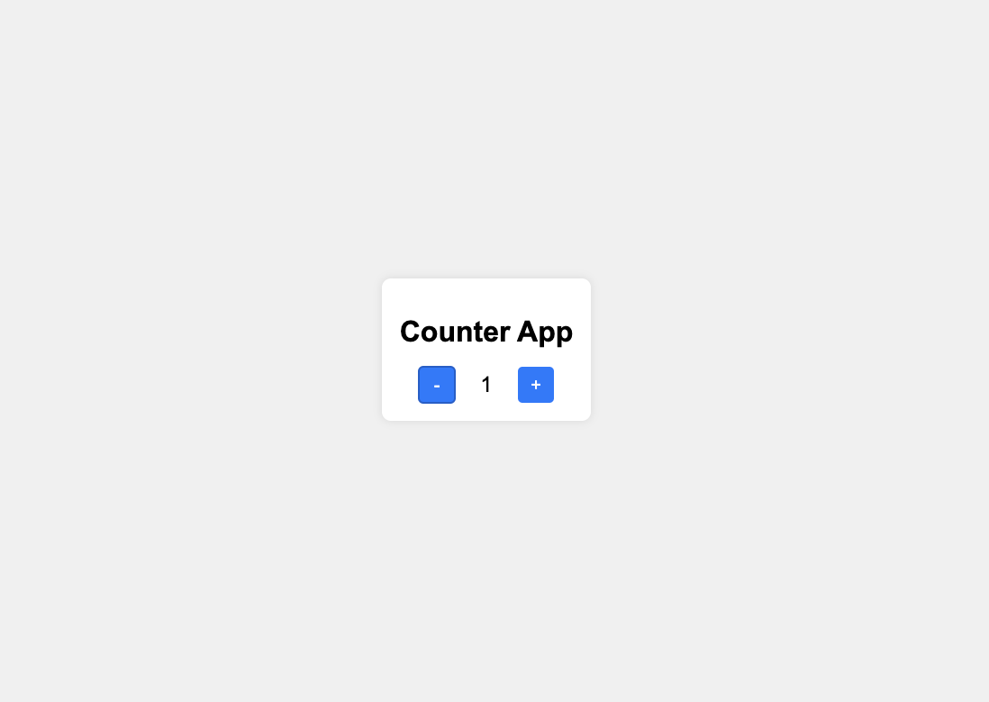
HTML Class + id
/* styles.css */

body {
  font-family: Arial, sans-serif;
  display: flex;
  justify-content: center;
  align-items: center;
  height: 100vh;
  margin: 0;
  background-color: #f0f0f0;
}

.counter-container {
  text-align: center;
  background-color: white;
  padding: 20px;
  border-radius: 10px;
  box-shadow: 0 0 10px rgba(0, 0, 0, 0.1);
}

h1 {
  margin-bottom: 20px;
}

.counter-controls {
  display: flex;
  align-items: center;
  justify-content: center;
}

button {
  width: 40px;
  height: 40px;
  font-size: 20px;
  background-color: #007bff;
  color: white;
  border: none;
  border-radius: 5px;
  cursor: pointer;
}

button:hover {
  background-color: #0056b3;
}

#count {
  font-size: 24px;
  margin: 0 15px;
  min-width: 40px;
  text-align: center;
}
CSS for React JSX / TSX
body {
  font-family: Arial, sans-serif;
  display: flex;
  justify-content: center;
  align-items: center;
  height: 100vh;
  margin: 0;
  background-color: #f0f0f0;
}

.counter-container {
  text-align: center;
  background-color: white;
  padding: 20px;
  border-radius: 10px;
  box-shadow: 0 0 10px rgba(0, 0, 0, 0.1);
}

h1 {
  margin-bottom: 20px;
}

.counter-controls {
  display: flex;
  align-items: center;
  justify-content: center;
}

button {
  width: 40px;
  height: 40px;
  font-size: 20px;
  background-color: #007bff;
  color: white;
  border: none;
  border-radius: 5px;
  cursor: pointer;
}

button:hover {
  background-color: #0056b3;
}

span {
  font-size: 24px;
  margin: 0 15px;
  min-width: 40px;
  text-align: center;
}
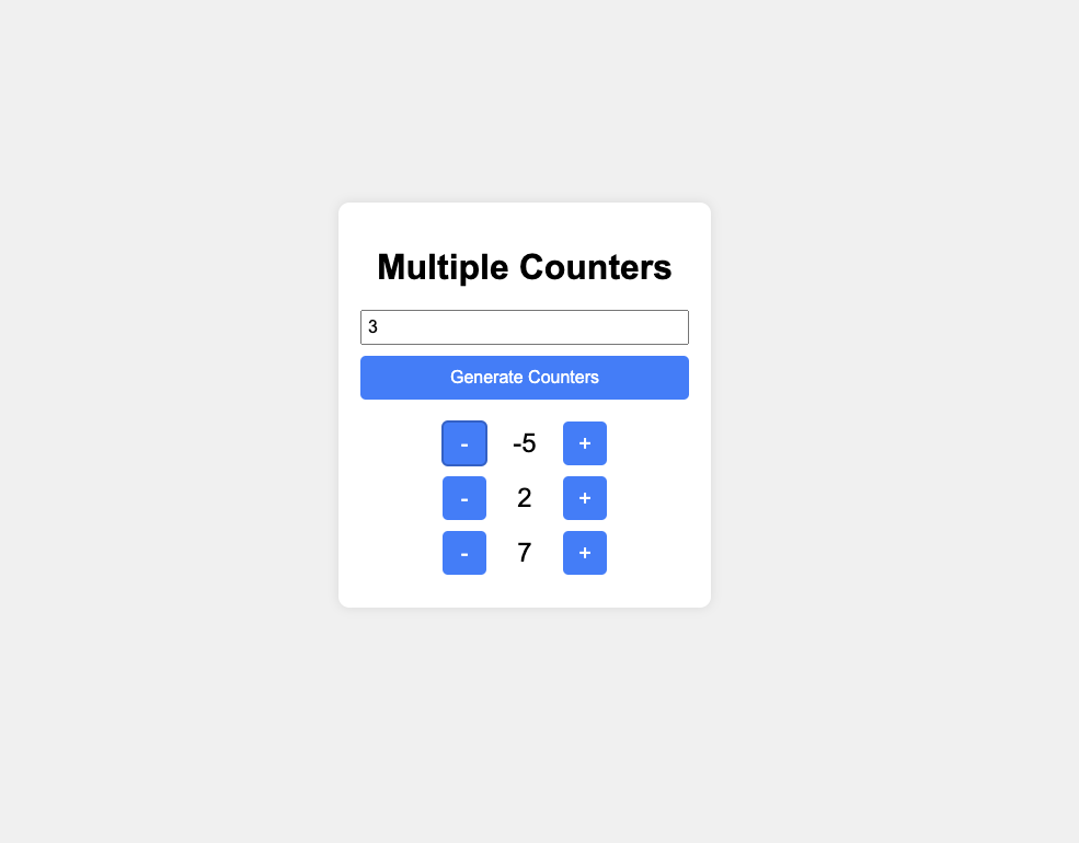
HTML Multiple Counters
/* styles.css */

body {
  font-family: Arial, sans-serif;
  display: flex;
  justify-content: center;
  align-items: center;
  height: 100vh;
  margin: 0;
  background-color: #f0f0f0;
}

.counters-container {
  text-align: center;
  background-color: white;
  padding: 20px;
  border-radius: 10px;
  box-shadow: 0 0 10px rgba(0, 0, 0, 0.1);
  width: 300px;
}

h1 {
  margin-bottom: 20px;
  font-weight: bold;
}

.counter-input {
  margin-bottom: 10px;
  padding: 5px;
  font-size: 16px;
  width: 100%;
  box-sizing: border-box;
}

.generate-button {
  display: block;
  padding: 10px;
  font-size: 16px;
  background-color: #007bff;
  color: white;
  border: none;
  border-radius: 5px;
  cursor: pointer;
  margin-bottom: 20px;
  width: 100%;
  box-sizing: border-box;
}

.generate-button:hover {
  background-color: #0056b3;
}

.counter {
  display: flex;
  align-items: center;
  justify-content: center;
  margin-bottom: 10px;
}

button {
  width: 40px;
  height: 40px;
  font-size: 20px;
  background-color: #007bff;
  color: white;
  border: none;
  border-radius: 5px;
  cursor: pointer;
}

button:hover {
  background-color: #0056b3;
}

.count {
  font-size: 24px;
  margin: 0 15px;
  min-width: 40px;
  text-align: center;
}
CSS for React JSX / TSX Multiple Counters
/* styles.css */

body {
  font-family: Arial, sans-serif;
  display: flex;
  justify-content: center;
  align-items: center;
  height: 100vh;
  margin: 0;
  background-color: #f0f0f0;
}

.counters-container {
  text-align: center;
  background-color: white;
  padding: 20px;
  border-radius: 10px;
  box-shadow: 0 0 10px rgba(0, 0, 0, 0.1);
  width: 300px;
}

h1 {
  margin-bottom: 20px;
  font-weight: bold;
}

.counter-input {
  margin-bottom: 10px;
  padding: 5px;
  font-size: 16px;
  width: 100%;
  box-sizing: border-box;
}

.generate-button {
  display: block;
  padding: 10px;
  font-size: 16px;
  background-color: #007bff;
  color: white;
  border: none;
  border-radius: 5px;
  cursor: pointer;
  margin-bottom: 20px;
  width: 100%;
  box-sizing: border-box;
}

.generate-button:hover {
  background-color: #0056b3;
}

#counters {
  display: flex;
  flex-direction: column;
  gap: 10px;
  align-items: center;
}

.counter {
  display: flex;
  align-items: center;
  gap: 10px;
}

button {
  width: 40px;
  height: 40px;
  font-size: 20px;
  background-color: #007bff;
  color: white;
  border: none;
  border-radius: 5px;
  cursor: pointer;
}

button:hover {
  background-color: #0056b3;
}

.count {
  font-size: 24px;
  min-width: 40px;
  text-align: center;
}